Overview
Our goal is to make research from the Cycling in Cities program, and elsewhere, into tools that are useful for policy-makers, planners, and the public.
We received funding from the Canadian Institutes of Health Research for a project with two components: an evidence-based audit of education materials related to cycling; and a tool to allow cities and citizens to evaluate the bikeability of their neighborhoods.
Creating bikeability maps
A large body of research has focused on walkability, and there are now popular online tools that allow individuals to calculate a “Walk Score” for their neighbourhood.

However, there has been little effort to define and map “bikeability”. There are important differences between walkability and bikeability. For example, whereas sidewalks are important to walking, our research has shown that bike routes (especially those separated from traffic) and flat terrain are key factors to encourage cycling.
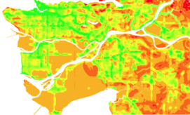
Given that determinants of walking and cycling are different, and cycling is an increasingly popular travel choice, we created a measure of bikeability to add to the transportation planning toolbox. The components of bikeability are based on the results of our research on cycling motivators and deterrents. Our bikeability measure was piloted in the Vancouver area (“bikeability heat map” shown above).
Bike score
We teamed with the Seattle-based company that developed Walk Score to create Bike Score based in part on our bikeability research. Environmental factors important to cyclists are used to calculate Bike Score:
- cycling infrastructure (separated bike lanes and bike paths, local street bikeways, painted bike lanes)
- topography (hilliness)
- desirable amenities (grocery stores, restaurants, schools, etc.) and road connectivity (both are components of Walk Score, which was used to capture these elements within Bike Score)
Bike Score is calculated for each location in a city, then mapped. The score can range from a low of 0 (deep red) to a high of 100 (dark green). By examining the “heat maps” of Bike Score for their city, municipal planners can locate neighbourhoods that are currently underserved and target them for improvements. The maps can be separated into their component parts (bike lanes, hills, destinations) to allow planners to determine which components contribute to a lower or higher score in a neighborhood. Individuals can use the maps to choose areas to live or cycle in.
Sample Bike Score Heat Map for Calgary

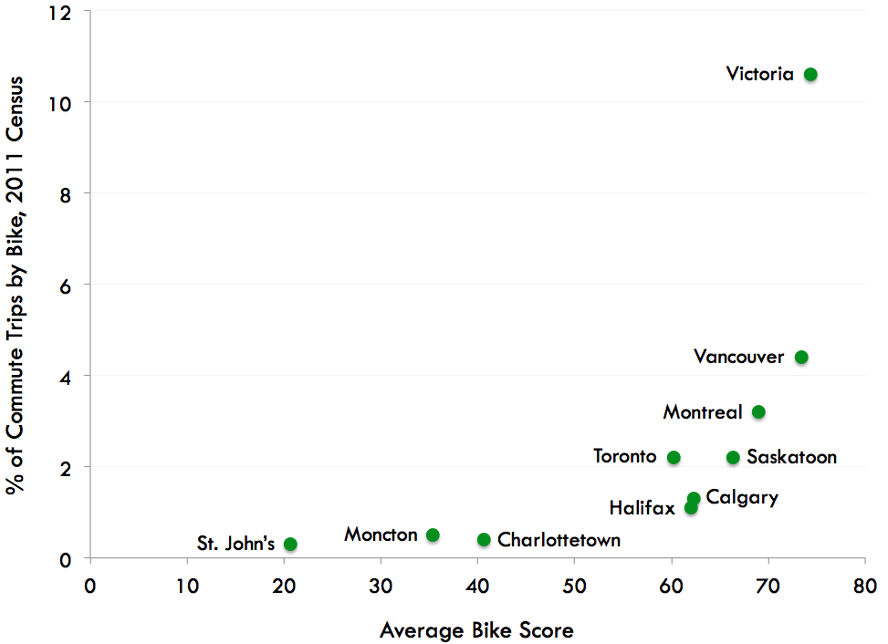
In May 2013 Bike Score was extended to include 12 Canadian cities and ~ 150 US cities. The graph below shows data for the initial 10 Canadian cities (May 2012). In cities with a higher average Bike Score, more people cycle to work (2011 Census). Of the 10 Canadian cities, the highest average scores were for Victoria, Vancouver and Montreal, and these three also had the highest % of commute trips by bike (from 3.2 to 10.6% of trips). It is important to note that there is lots of room to improve, since Bike Score averages for Canadian cities are all below 75. And cycling in most Canadian cities pales in comparison to cities in northern Europe with 10 to 40% of commute trips by bike.
Average Bike Score for 10 Canadian Cities vs. % of Commute Trips by Bike
Publications
We also examined the relationship between Bike Score and % of commute trips by bike in 24 US and Canadian cities, at the census tract level. The association was not strong and differed by city, but on average census tracts with Bike Scores over 90 had 4% more commute trips by bike than those with Bike Scores of 25 or lower.


